# Customizing the UI Elements
All of the UI Elements are fully styled and ready to use without any customization, but there are plenty of scenarios where developers might want to customize the look and feel of a particular element. Perhaps you need to match the element's appearance to your brand's styleguide, or maybe you need to support alternative theming options ("dark mode", anybody?). Every UI Element has been built with this kind of customization in mind.
## Custom colors with styles.colors
Colors are the most commonly customized part of the UI Elements. To keep that level of customization as simple as possible, key colors in the UI Elements can be set when an element is initialized using the `styles.colors` option.
```js
CronofyElements.AvailabilityRules({
/* other configuration options */
styles: {
colors: {
hairline: "#15b3d6",
available: "green",
unavailable: "red"
}
}
});
```
For elements that support this feature, you can view all the available `styles.colors` options on that element's documentation page.
- [Agenda View's `colors` options](/developers/ui-elements/agenda-viewer/index.md)
- [Availability Viewer's `colors` options](/developers/ui-elements/availability-viewer/index.md)
- [Availability Rules' `colors` options](/developers/ui-elements/availability-rules/index.md)
## Custom CSS with styles.prefix
Every element can be given a "style prefix" as a configuration option. All customizable DOM nodes within the element use this prefix in their class names. For example, if the `prefix` was set as "Foo", the class name on a slot node would be `Foo__slot`.
```js
CronofyElements.AvailabilityViewer({
/* other configuration options */
styles: {
prefix: "custom-name"
}
});
```
If left unset, the `style.prefix` defaults to the name of the element (e.g. `"AvailabilityViewer"`).
To be sure to avoid specificity issues with CSS, make sure any custom selectors
you add are preceded by `.PREFIX`. For example, if your prefix is `ABC`, you
would target the button styles with this selector:
```css
.ABC .ABC__button {
/* your button styles go here */
}
```
## Customizing translation strings
All visible text within the elements is translated, but sometimes it may be necessary to override some of the translations. This could be to change one particular bit of text in an existing language, or to add an entirely new locale for your application. To override any of the translation strings, you should pass an object to the `translations` initialization option.
Translation objects are organized by locale and by context, and follow this structure:
```js
{
en: {
availability_viewer: {
available: "Available",
confirm: "Confirm",
end: "End",
// ...other availability_viewer strings
},
// ...other en contexts
},
fr: {
availability_viewer: {
available: "Disponible",
confirm: "Confirmer",
end: "Fin",
// ...other availability_viewer strings
},
// ...other fr contexts
},
// ...other locales
}
```
Every supported locale contains a full set of contexts:
- `agenda`
- `availability_rules`
- `availability_viewer`
- `calendar_sync`
- `slot_picker`
Each UI Element has a corresponding context. When selecting a string to render, the first match found in the following sequence is chosen:
- `locale.element.key`
- `en.element.key`
### “Keys” locale
You can use the "utility" locale of `keys` to display the translation slugs within an element's UI. Applying this locale will display the context and translation slug in place of every string, in the format `context.slug`.
```js
CronofyElements.SlotPicker({
/* other parameters */
locale: 'keys'
});
```
## Customization examples
With the ability to apply your own CSS to the UI Elements, the customization options are nearly limitless. Here are a few examples of some common scenarios:
- [Customizing the color of grid borders](#customizing-the-color-of-grid-borders)
- [Repositioning the week-navigation in the Availability Viewer](#repositioning-the-week-navigation-in-the-availability-viewer)
- [Change the 'available' and 'unavailable' colors in the Availability Rules element](#change-the-available-and-unavailable-colors-in-the-availability-rules-element)
- [Change the “Save new rules” button text in the Availability Rules element](#change-the-save-new-rules-button-text-in-the-availability-rules-element)
### Customizing the color of grid borders
Changing the color of the grid-lines and borders for the Availability Viewer and Avaialability Rules elements can be easily achieved using the `style.colors` initialization option. The same effect is also possible by writing custom CSS, but requires more detail to implement fully.
**1. Using the `style.colors` options:**
```js
CronofyElements.AvailabilityViewer({
/* other configuration options */
styles: {
colors: {
hairline: "#15b3d6"
}
}
});
```
**2. Using custom CSS:**
```css
.PREFIX .PREFIX__button,
.PREFIX .PREFIX__timelines,
.PREFIX .PREFIX__example,
.PREFIX .PREFIX__grid-column{
border-color: #15b3d6;
}
.PREFIX .PREFIX__timeline path {
stroke: #15b3d6;
}
```
*Note: SVG nodes require the `stroke` property to be set, and require extra selector-specificity.*
### Repositioning the week-navigation in the Availability Viewer
To move the week-navigation buttons in the Availability Viewer element, you need to apply some `absolute` positioning (and add a little padding to the top bar to make space for the repositioned buttons):
```css
.PREFIX .PREFIX__navigation {
position: absolute;
top: 0;
right: 0;
}
.PREFIX .PREFIX__month-labels {
padding-top: 20px;
}
```
### Change the ‘available’ and ‘unavailable’ colors in the Availability Rules element
**1. Using the `style.colors` options:**
```js
CronofyElements.AvailabilityRules({
/* other configuration options */
styles: {
colors: {
available: "#15b3d6",
unavailable: "red"
}
}
});
```
**2. Using custom CSS:**
```css
/* Available color */
.PREFIX .PREFIX__slot-background.PREFIX__slot-background--available,
.PREFIX .PREFIX__example.PREFIX__example--available {
background-color: #15b3d6;
}
/* Unavailable color */
.PREFIX .PREFIX__slot-background.PREFIX__slot-background--unavailable,
.PREFIX .PREFIX__example.PREFIX__example--unavailable {
background-color: red;
}
```
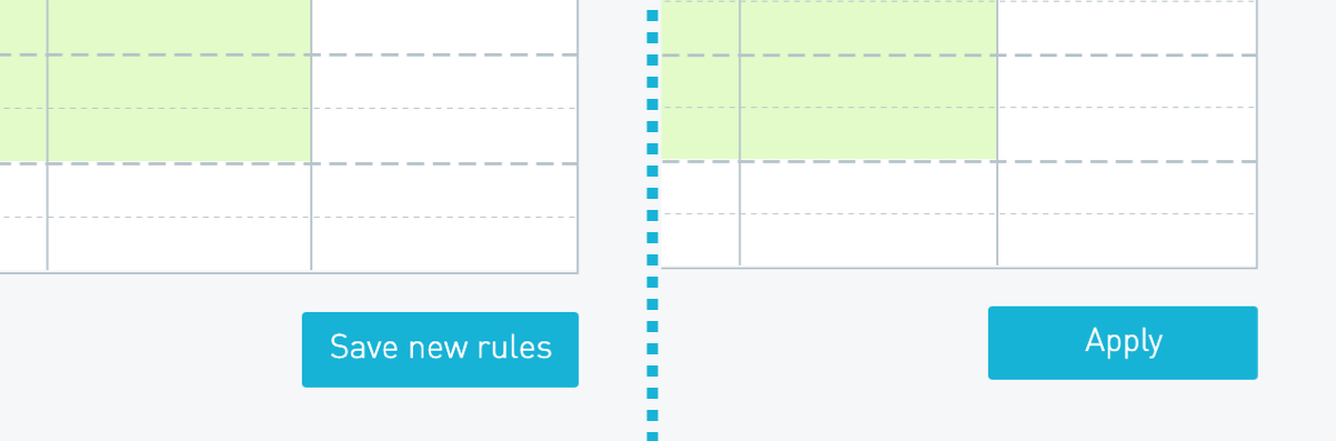
### Change the “Save new rules” button text in the Availability Rules element
To override a specific translation slug, you need to pass an object to the `translations` parameter that contains the `locale`, `context`, and `slug` for the string you want to replace, along with the new string you want to inject. The simplest way to find the `context` and `slug` information is to use the ["keys" locale](/developers/ui-elements/customization/index.md).
Once you know the context and slug for your target string, you pass that into the `translations` parameter when initializing the element. In this instance the context will be `availability_rules` and the slug will be `save_new_rules`:
```js
CronofyElements.AvailabilityRules({
/* other configuration options */
translations: {
en: {
availability_rules: {
save_new_rules: "Apply"
}
}
}
});
```
---
[Read in HTML](/developers/ui-elements/customization/)