Date Time Picker
Read as Markdown Required plan: EmergingThe Date Time Picker Element is an embeddable interface for visualizing real-time availability. It converts an Availability query into a calendar highlighting the available days with a list of the available slots for each day. It also provides a dropdown to allow the user to select a specific timezone to view the availability in.
When a user confirms a slot, the Element passes that slot’s details into a callback function (provided when the Element is initialized).
Demo #
Example initialization #
<div id="cronofy-date-time-picker"></div>
<script src="https://elements.cronofy.com/js/CronofyElements.v1.67.7.js"></script>
<script>
    CronofyElements.DateTimePicker({
        element_token: "{ELEMENT_TOKEN}",
        target_id: "cronofy-date-time-picker",
        availability_query: {
            participants: [
                {
                    required: "all",
                    members: [
                        { sub: "acc_5ba21743f408617d1269ea1e" },
                        { sub: "acc_64b17d868090ea21640c914c" }
                    ]
                }
            ],
            required_duration: { minutes: 30 },
            query_periods: [
                { start: "2026-07-13T09:00:00Z", end: "2026-07-13T17:00:00Z" },
                { start: "2026-07-14T09:00:00Z", end: "2026-07-14T17:00:00Z" }
            ]
        },
        styles: {
            prefix: "custom-name"
        },
        callback: notification => console.log("callback", notification)
    });
</script>
Element permissions #
Only availability is required when generating the Element Token.
Element options #
element_token required #
The Element Token the Date Time Picker will use to communicate with Cronofy.
Not required if the Element is activated in demo mode.
target_id required #
The ID of the DOM node the Element will be loaded in to.availability_query required #
Object describing the Cronofy Availability request used to generate the offered times.The Date Time Picker will paginate queries for availability, only querying for the currently-displayed month view. This means that the normal 35-day maximum for query_periods does not apply.
As a result, query_periods for the Date Time Picker can span many months, up to the limit of 201 days in the future.
Sequenced Availability #
It is possible to use the Date Time Picker to display Sequenced Availability by using a Sequenced Availability query in place of a standard query. This feature is available from v1.43.0.
sequence_title optional #
The Date Time Picker Element allows an additional string attribute of sequence_title to be passed with each sequence object in a Sequenced Availability query.
An example of a sequence with a sequence_title:
{
"sequence_id":"123",
"sequence_title": "An example title",
"ordinal":1,
"participants":[
{
"members":[
{
"sub":"acc_12345678",
}
],
"required":"all"
}
],
"required_duration":{ "minutes": 60 }
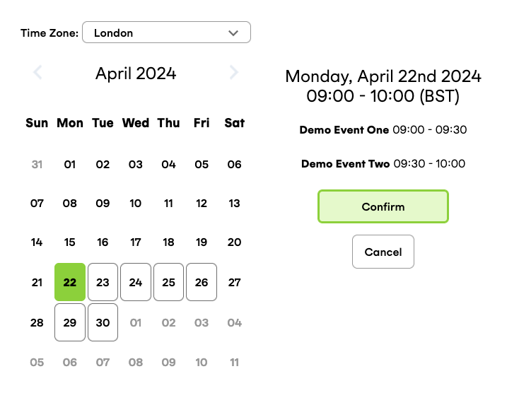
}When in confirm mode, this enables the confirm screen to show a breakdown of the individual event times in the sequence a user has selected. The breakdown is also passed as part of the slot_selected notification.
If no-confirm mode is selected, you will see the sequence as one slot in the UI but this will create separate events in the backend as the slots are selected.
See an example of sequenced availability in confirm mode below:
Available classes to style the sequence breakdown:
{PREFIX}__confirm-details--sequence{PREFIX}__confirm-details--sequence-title{PREFIX}__confirm-details--sequence-time
config.slot_button_mode optional #
This config option takes two “modes”:summary(default)detailed
When using a Sequenced Availability query, the detailed mode will set the slot buttons to show a breakdown of the indivual times in a sequence.
Available classes to style the detailed slot button:
{PREFIX}__time-slot--detailed{PREFIX}__detailed-slot-list{PREFIX}__detailed-slot-list--item
callback required #
The function to be called when an action has occurred within the Element. Receives an object in the format:
{
    "notification": {
        "type": "notification_type"
    }
}
The object will always include a notification object with a type attribute to allow you to determine how to handle it. New notifications will be added in the future and differentiated by having new type values, so your application should ignore notification types that do not exist in the current list.
date_selected
Sent by the Element when the user has selected a date from the calendar view.
{
    "notification": {
        "type": "date_selected"
        "date": "2026-07-13"
        "tzid": "Europe/London"
    }
}
slot_selected
Sent by the Element when in the confirm mode after the user has confirmed
their selection, and straight away when the slot is selected in no_confirm
mode.
{
    "notification": {
        "type": "slot_selected"
        "slot": {
            "start": "2026-07-13T09:00:00Z",
            "end": "2026-07-13T11:00:00Z",
            "participants": [
                { "sub": "acc_5ba21743f408617d1269ea1e" },
                { "sub": "acc_64b17d868090ea21640c914c" }
            ]
        }
        "tzid": "Europe/London"
    }
}
no_slots_found
Sent by the Element when the provided availability_query has returned no available slots.
{
    "notification": {
        "type": "no_slots_found"
    }
}
data_center optional #
Designates the Cronofy data center the Element will communicate with.Default value is us.
config optional #
Use this object to add further configuration to the Element:config.mode optional #
The Date Time Picker Element has two “modes” it can operate in:confirm(default)no_confirm
When in confirm mode, clicking a slot displays a confirmation view that allows a user to confirm their selection or return to the list of slots. The callback function will be called with a slot_selected notification when a user confirms their selected slot.
When in no_confirm mode, the “confirmation” step is skipped. In this mode, the callback function will be passed a slot_selected notification when a user selects a slot, without any confirmation step.
config.logs optional #
Set the level of logging you want to appear in the console:info: show verbose logging (recommended for development use only).warn: (default) only log errors and warnings.error: only log errors.none: suppress all console output from the Element.
config.tz_list optional #
The Date Time Picker Element includes a timezone dropdown that allows the user to view the available days and times in a timezone of their choice.This config option allows you to set an array of timezones you want to appear in the timezone dropdown:
"tz_list": [
    "America/Sao_Paulo",
    "Etc/UTC",
    "Pacific/Fakaofo",
    "Europe/London",
],
The list must be made up of known time zone identifiers from the IANA Time Zone Database. Setting this option will entirely override the default list, so ensure you include all the timezones you need.
config.selected_date optional #
This config options allows you to set the initial selected date. The option accepts a string date in the format"YYYY-MM-DD".If this option is not set, or an invalid date is used, it will fallback to the first date that has available slots, based on the results of the availability_query.
config.display_slot_timezone optional #
This config option allows you to toggle the display of the timezone abbreviations next to time slot information on the slot buttons, and the confirm screen.The value is set to true by default, setting it to false will hide the timezone abbreviations.
config.month_view_mode optional #
This config option takes two values:overflow(default)minimal_overflowsingle
The default overflow mode displays an even 6 week grid, with days in the previous and next months filling in any days of the week necessary to fill the grid.
Based on the set config.week_start_day and the day of the week that is the 1st of the selected month, the default mode can result in an entire week for the next month being displayed. Setting the mode to minimal_overflow will ensure that the weeks being displayed only contain days from the selected month, and any necessary overflow to ensure an even grid view.
Setting the mode to single will hide any days outside of the current month from the view. The default option of overflow will include any overflowing days in the view to create a consistent grid.
config.display_slot_navigation optional #
This config option allows you to toggle the display of two new navigation buttons that will appear below the list of available slots. These buttons will make it easier for a user to navigate through the available days, particularly when viewing the Date Time Picker on smaller screens such as mobiles.The value is set to false by default, setting it to true will display the new buttons.
styles optional #
An object that controls the pre-packaged element styles.styles.prefix optional #
Customizable elements are given a prefixed class name using this value. For example, if theprefix was set as “Foo”, the class name on a slot element
would be Foo__time-slot.Defaults to DTP.
styles.colors optional #
Use these options to set the colors for various parts of the Element without the need to add your own custom CSS. Each color option accepts either a valid HEX code (e.g.available: "#FF0000") or a browser-safe color name (e.g. button: "tomato")black- defaults to#000000white- defaults to#ffffffneutralDark- defaults to#6f6f6fneutral-#999999neutralLight-#e4ebf2,button- button background color. Defaults to#15B3D6buttonConfirm-#e2fac8,buttonConfirmText- confirm button text color. Defaults to theblackvariable.buttonHover- button background color when hovered.buttonText- button text color. Defaults to theblackvariable.buttonTextHover- button text color when hovered. Defaults to theblackvariable.buttonActive- button background when selected/active.buttonActiveText: button text color when a button is active/selected. Defaults to theblackvariable.
demo optional #
Boolean to activate demo-mode. Defaults tofalse. If demo is set to true
the Element will return mock data (and not make any API calls).locale optional #
The Date Time Picker supports localization (e.g.locale: "fr" to load in French). Defaults to browser language setting.Supported locales (languages) for the UI Elements are:
arArabiccsCzechcyWelshdeGermanenUS English (default)esSpanishfrFrenchfr-CACanadian FrenchheHebrewitItalianjaJapanesenlDutchplPolishpt-BRBrazilian PortugueseruRussiansvSwedishtrTurkishzh-CNSimplified Chinese
translations optional #
To override either a locale or a particular string, pass in a translations object here. The Date Time Picker uses thedate_time_picker translation “context”.Read more about customizing translations
tzid optional #
The time zone that the Date Time Picker will be rendered in. Must be a known time zone identifier from the IANA Time Zone Database.If this value is not set, or is set to an invalid tzid then the Element will use the system time zone from the user’s browser and trigger a warn notification.
Be aware, using the tzid option will cause the Date Time Picker to render in a timezone that may not match the timezone of the user’s computer. Be sure to highlight this to the user.
Element classes #
PREFIX default is DTP
Available classes:
{PREFIX}__details{PREFIX}__calendar-header{PREFIX}__calendar-header-button{PREFIX}__calendar-grid--week-day{PREFIX}__calendar-grid--button{PREFIX}__calendar-grid--available{PREFIX}__calendar-grid--focused{PREFIX}__slots-list{PREFIX}__no-slots{PREFIX}__time-slot{PREFIX}__confirm-details{PREFIX}__confirm-button{PREFIX}__cancel-button
Element methods #
refresh() #
From time to time you may wish to reload the DateTimePicker UI Element on the page. You can do this with the DateTimePicker.refresh() method:
// Load DateTimePicker Element:
const DateTimePicker = CronofyElements.DateTimePicker(optionsObject);

// Refresh the DateTimePicker Element:
DateTimePicker.refresh();update() #
Should you need to update the options for any Element, you can reload them with the .update() method (this requires you to have saved your Element instance to a variable beforehand):
// Load DateTimePicker Element:
const DateTimePicker = CronofyElements.DateTimePicker(optionsObject);

// Update the DateTimePicker Element with new options:
DateTimePicker.update(newOptions);
When updating, you do not need to redeclare all the options; you just need to add the ones you want to update.
Note: the DateTimePicker.update() method must be called with an options object, otherwise a warning-level log notification will be fired.
Accessibility #
The Date Time Picker Element has been built with accessibility in mind to help provide a better experience for all users. In it’s default state, the Element meets WCAG 2.1 standards.
Screen reader support
There are additional, visually hidden labels on certain buttons to help provide context to screen reader users.
The translation names for these are:
confirm_slot_title: a title for the confirmation dialognav_previous_month: a title for the “previous” calendar navigtion buttonnav_next_month: a title for the “next” calendar navigtion buttonselect_time_slot: visually hidden pre-text on the time slot buttons
Keyboard support
Additional keyboard functionality has been built into the timezone dropdown and the calendar grid.
When the timezone option list has focus:
- The
upordownarrow keys will navigate through the list - The
Enterkey will select a timezone - The
Esckey will close the timezone dropdown
When the calendar grid has focus:
- The
up,down,leftandrightarrow keys will navigate through the available days. Unavailable days will be skipped. - The
Enterkey will select a day and move the focus to the first option in the time slots list.